
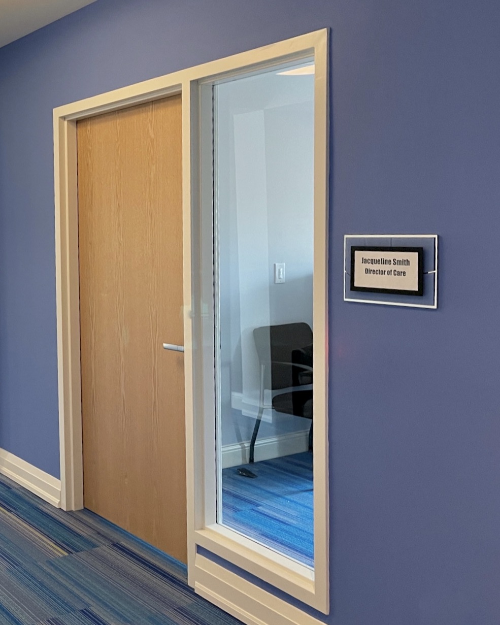
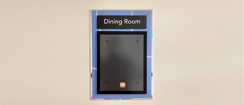
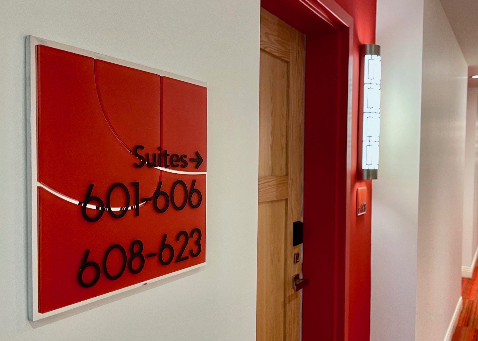
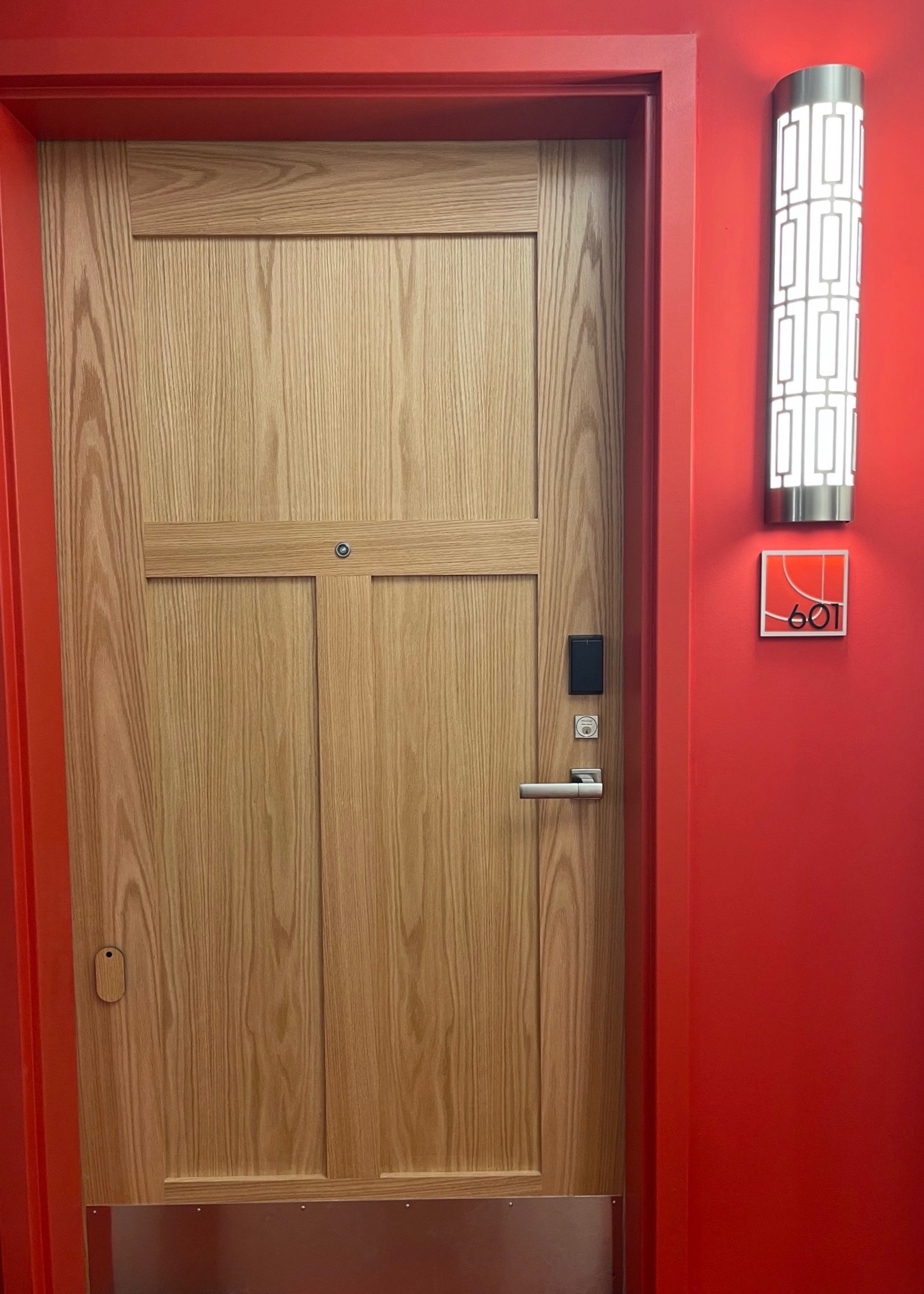
Challenge
Strong, vivid colours are used throughout the The Jacob’s multi-storey senior living residence. The accompanying signage needed to complement the different colours on each of the upper floors and include the logo – yet still stand out.
Solution
We selected chrome to match the lighting and fixtures used in the residence to create a clean, classic look for each of the signs. We were able to incorporate The Jacob’s logo by using a line drawing version. The pieces for the logo were cut out to retain its basic theme and then each sign was assembled with white gloves to eliminate fingerprints, dust and smudges. The same care was used during installation to ensure the signs retained their pristine appearance.
Client
The Jacob Senior Living, Beamsville, ON


